WeTransfer helps people move ideas with their easy to use file transfer platform. I helped improve the acquisition channels for their premium product, WeTransfer Plus.
UI/UX Design
WeTransfer Plus Wallpaper Campaign
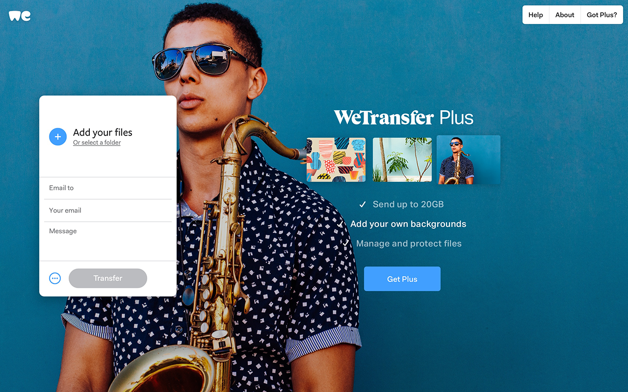
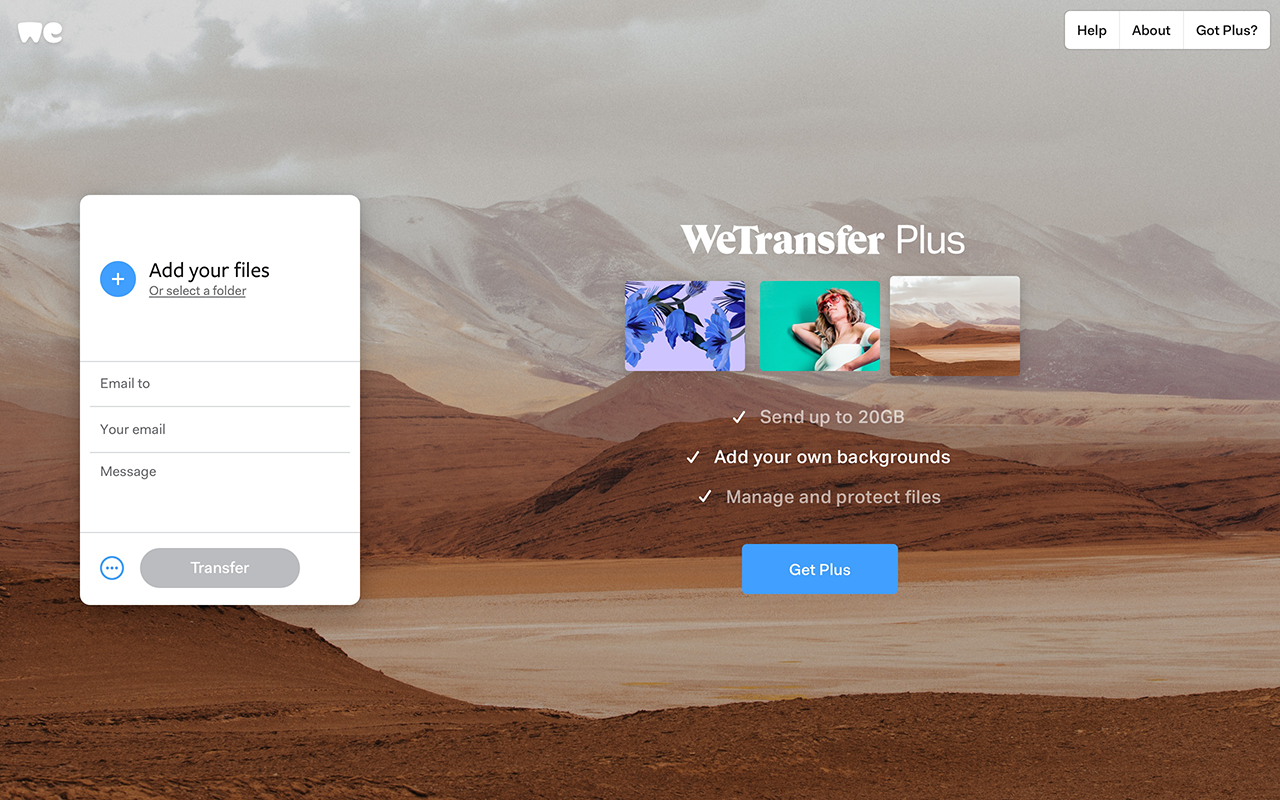
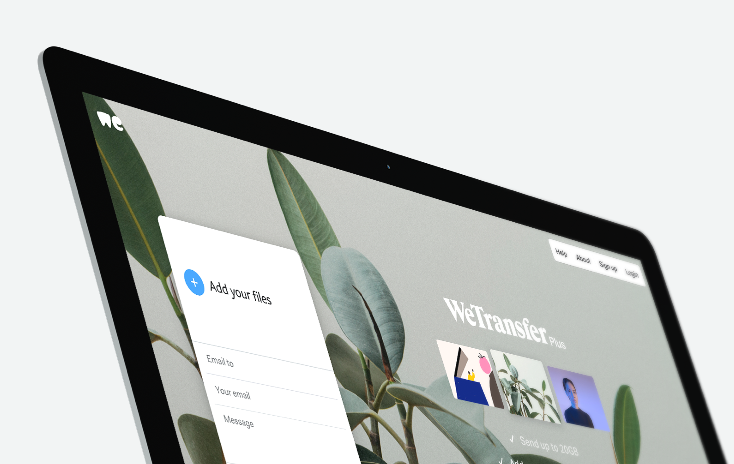
Unlike other file-sharing platforms, WeTransfer Plus is unique in the way it uses almost the entire background of the browser to showcase and promote your brand, creating an impactful and immersive experience. I wanted to emphasise this by utilising the background to communicate the main features.
The images can be replaced to create new versions of the campaign, ultimately increasing the versatility and lifespan.
WeTransfer Free Account Landing Page
WeTransfer needed a landing page to showcase and promote the limited features offered by their new free account. Using the WeTransfer brand style I designed a landing page containing simple yet strong animated visuals in combination with a subtle parallax effect to communicate the key features for the free account.
I animated the visuals I created for the features using a combination of AE and Lottie which helped further communicate the feature benefit.
Plus to Pro Takeover Campaign
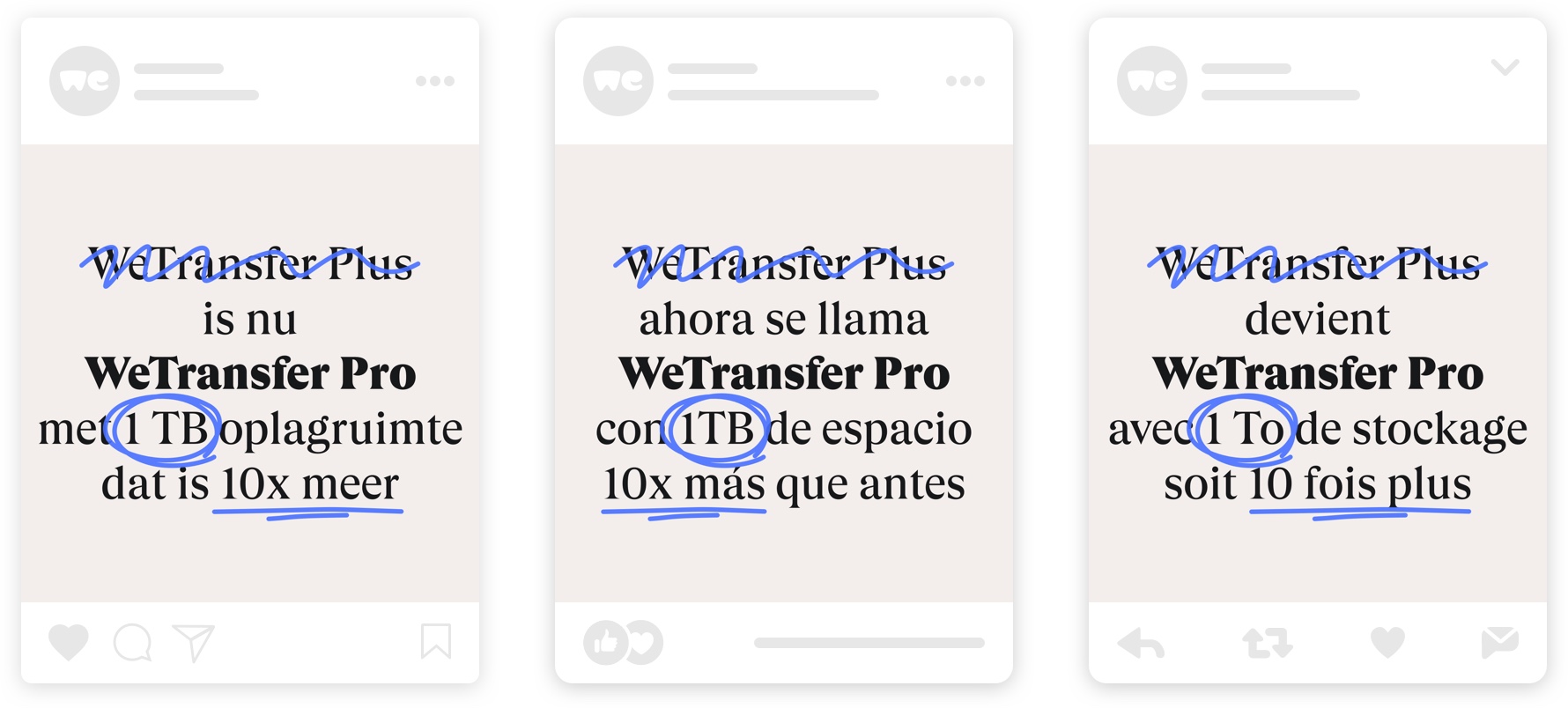
WeTransfer Plus was changing its name to WeTransfer Pro and wanted the world to know. They needed a simple campaign in multiple languages for their platform, email, and social media channels.
We chose to go with a direct message to communicate instantly while highlighting key points using animated scribbles. The message was then translated into 11 languages.
UI/UX Optimisation
With over 50 million users per month, any small change can increase conversion significantly. I helped optimise elements of the user interface such as the main navigation, transfer window, splash-page, and side-panel to help increase traffic to the WeTransfer Plus and sign up page.
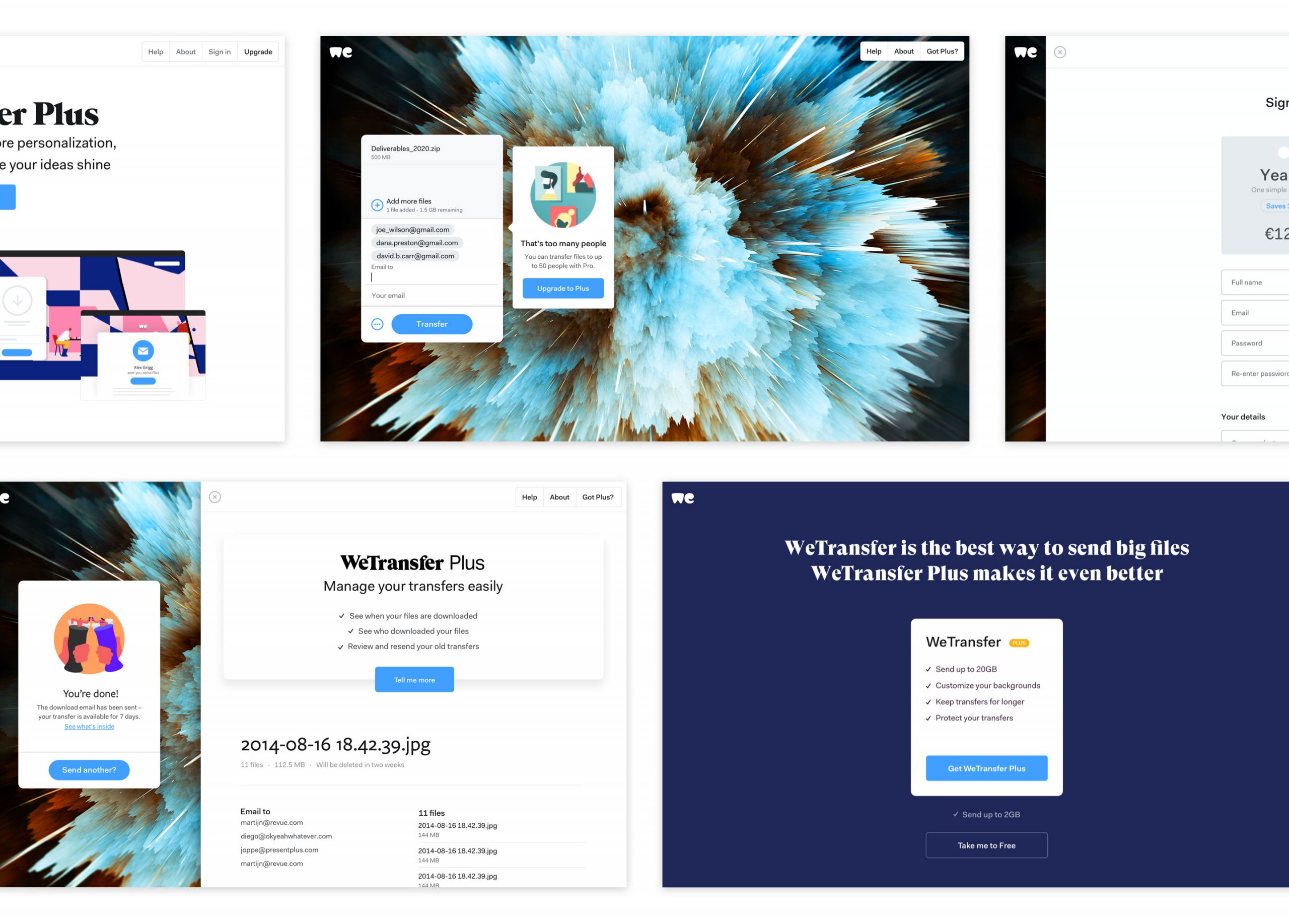
One example was to reveal Plus features earlier within the transfer window flow without changing the size or structure of the transfer window. I created several prototypes to explore designs and micro-interactions as possible solutions to test with users.
A. Text field focus triggers auto scroll to reveal Plus features.
B. Text link button triggers auto scroll to reveal Plus features. The button hides on auto scroll and shows again once the user scrolls back up.
C. Text link button triggers auto scroll to reveal Plus features and remains visible.
